Color gradient is a tool we use a lot in Photoshop
I'm sure a lot of people think it's a very simple tool, just move the little slider on the top and you're done!
So is that what actually happened?
Today, we will talk about the use of color gradation.
Before we begin, understand these terms
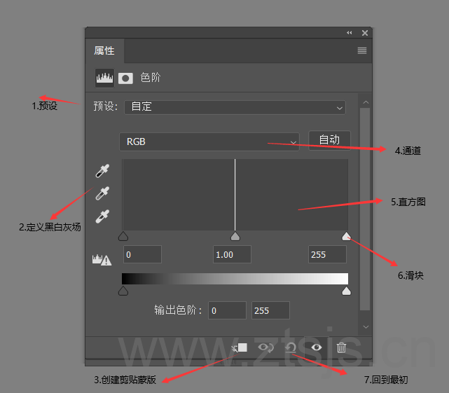
(1) Preset: pre-set for you to set up some of the effects, we rarely use in the post, generally use the default values

(2) Defining black and white gray fields
It is mainly used to define the brightest and darkest points in an image and to correct color contrast.
(3) Create Clip Mask
Once created, the adjustment of the color gradient will only work on the layer below it, not on all layers
(4) Channel
RGB channel is mainly to adjust the image of the relationship between light and dark, red, green, blue three channels is mainly on the image of the adjustment of hue
(5) Histogram
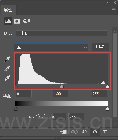
The histogram mainly tells you the distribution of light and dark pixels in the image. The leftmost black slider indicates the dark part of the image, the middle slider indicates the midtones, and the rightmost indicates the light part.
(6) Slider
Change the size of the value by dragging the slider
(7) Reset adjustment value
Change the adjusted value back to the original time, so I give him the title back to the original time here
How to read whether this image is light or dark by histogram in color gradient
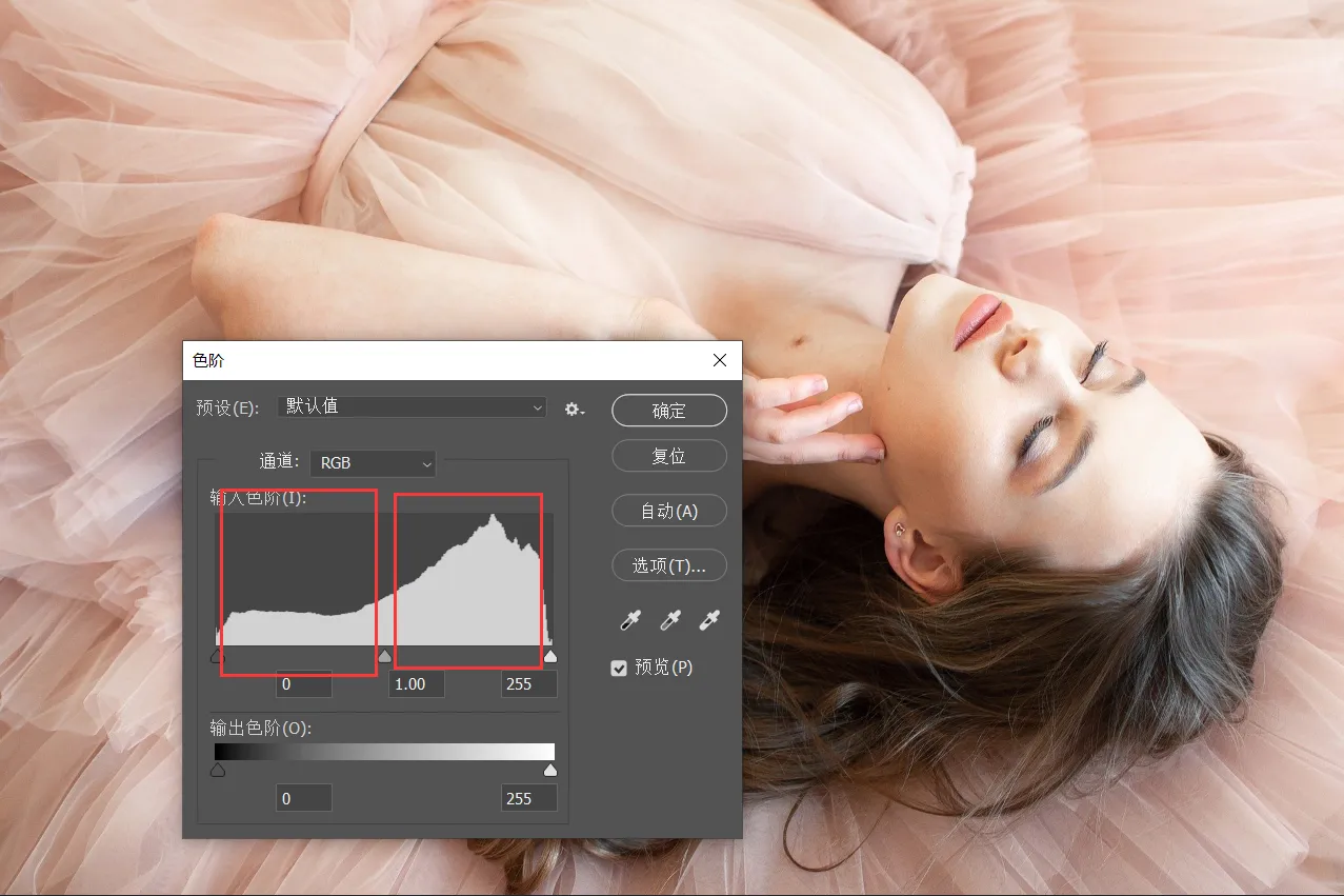
In the image above, we determine the light and dark tones of the image based on the white areas of the black, gray, and white sliders in the histogram, and it's clear that the white areas in the gray and white sliders in the histogram are redundant to the areas of the black slider, so the image is light-toned
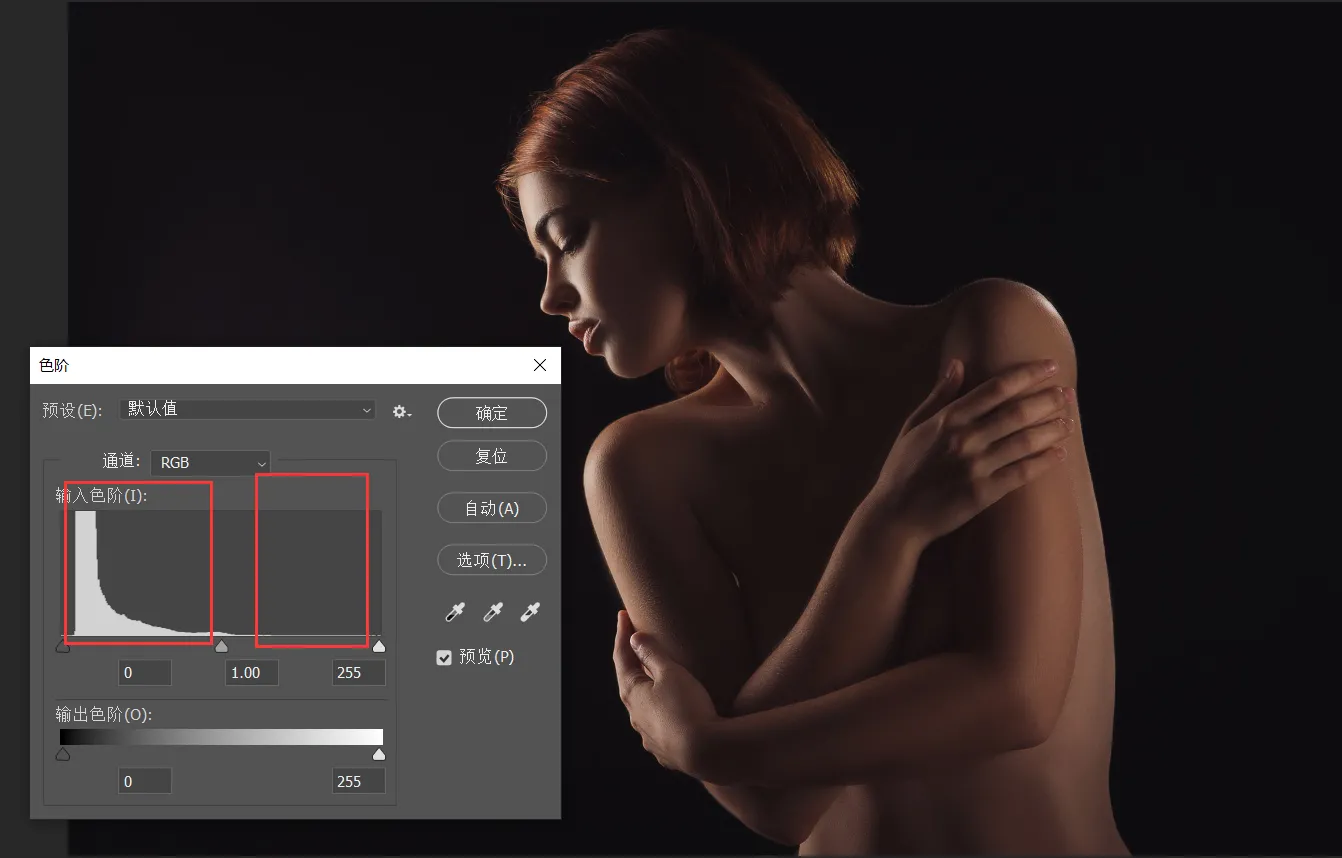
In this image, the black slider of the histogram has significantly more area than the white slider, so this image is darker in tone
Here's a tip on how to adjust the contrast of an image via color gradation
Let's take a look at this chart
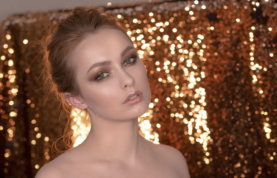
Can you tell what's wrong with this picture?
That's right it's too white, like it's fogged over, in professional terms we call it a lack of contrast in the image
What is the contrast of an image
Image contrast refers to the measurement of the different brightness levels between the brightest white and darkest black in the light and dark areas of an image, i.e., the size of the gray-scale contrast of an image. A larger range of differences means greater contrast, and a smaller range of differences means less contrast. A good contrast ratio is more likely to show vivid, rich colors.
How do we use the color scale to adjust the contrast of an image, think about what image contrast means, we just need to make this image brighter in the bright areas and darker in the dark areas
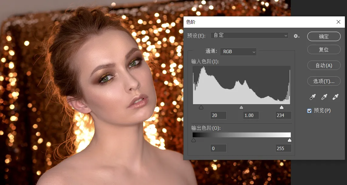
Here to tell you a little bit, the slider is how to use, the black slider indicates the dark part, to the right will expand the dark information, the gray slider in the middle is to indicate the middle tone, to the right to increase the light part, want to the left to increase the dark part, the white slider to the left is to increase the light part.
Similarly in the red, green and blue channels
Here's what we're going to teach you that's the point of the day
Many images in Photoshop are toned in the red, green, and blue channels, such as color gradients, curves, hue saturation, channel mixer, and so on
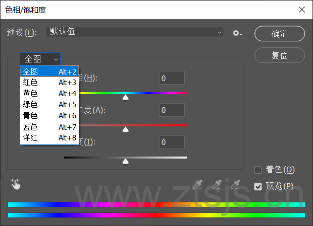
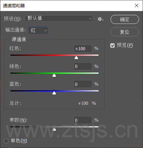
So do you really know how color mixing works, today I'm going to take color gradients as an example
Let's open a clip image
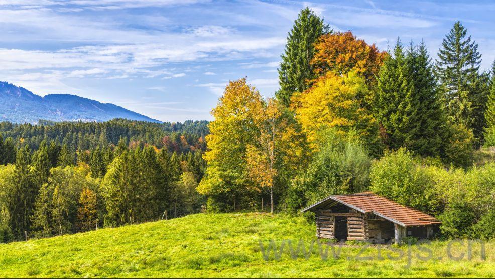
Here I think his grass and trees are not green enough I want to make it a little greener, we just need to add his green message in the green channel
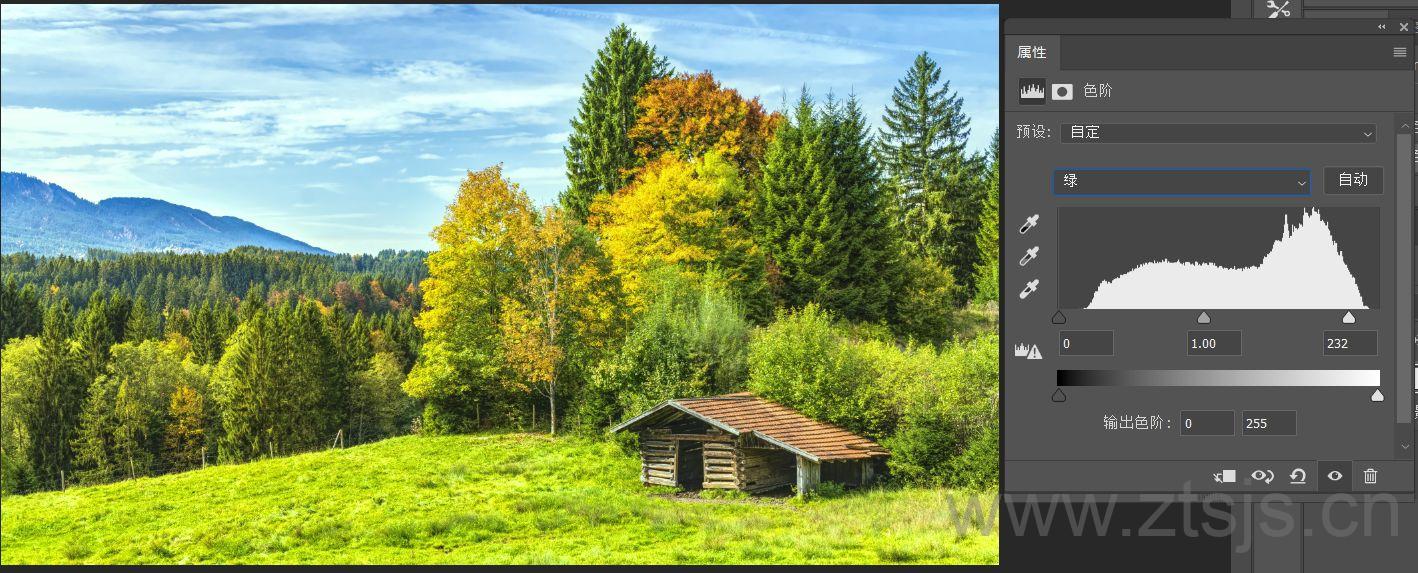
So if I want to turn it into the feeling of autumn how to get, autumn is yellow, but the three channels inside the yellow channel does not have this option, how to do it, we just need to adjust the value of the red channel, is not it into the effect of the fall, the

Some people may say, look at this sky and the color of the house also changed, not good at all, we just use the brush in the mask to paint on it, like the following
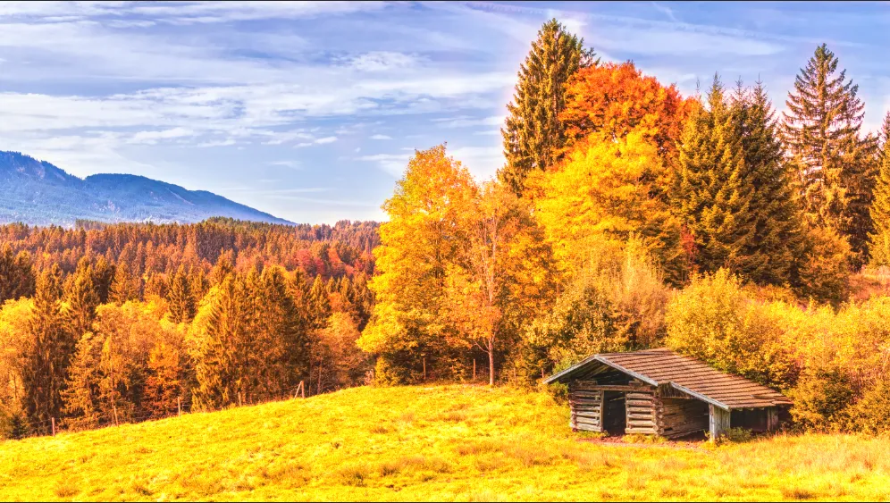
Going back to the earlier point, why do I use the red channel to turn him yellow, theThat's because red and green on top of each other turns yellow.
We know that the color mode of the image is generally RGB mode, RGB refers to red, green and blue, is also the three primary colors of light
Red over blue produces magenta, red over green produces yellow, and blue over green produces cyan.
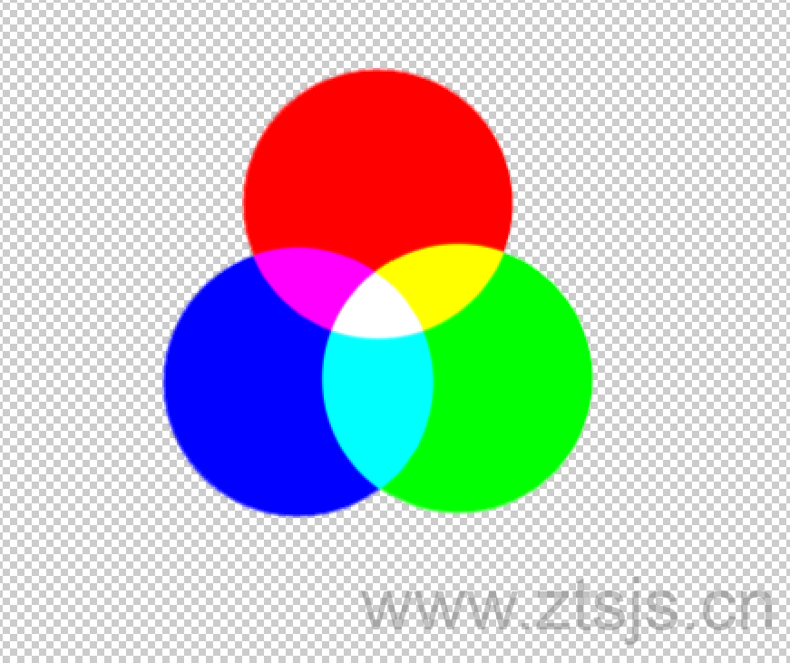
So the toning of an image is the superimposition of different color shades on each other to create other color effects.
The colors produced when two primary colors are superimposed on each other are known as intercolors, cyan, magenta, yellow, the
These three intermediate colors are in turn the complementary colors of red, green, and blue respectively

In the adjustment channel, the right side of the red channel represents red, and the left side represents cyan
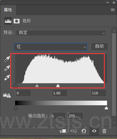
The green channel is green on the left and magenta on the right.

The blue channel is blue on the left and yellow on the right
Here's one last case to end today's lesson
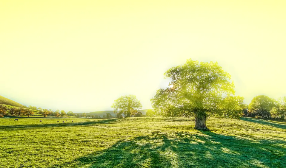
I want to make this image look like a yellow sky, how do I do that with the color scale
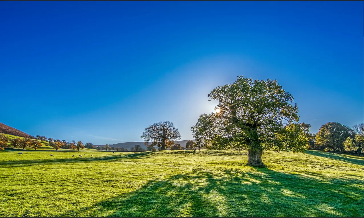
Let's analyze this first.The yellow is composed of red and green superimposed on the sky is blue, we need to change it to green or red, and then use the channel to adjust!
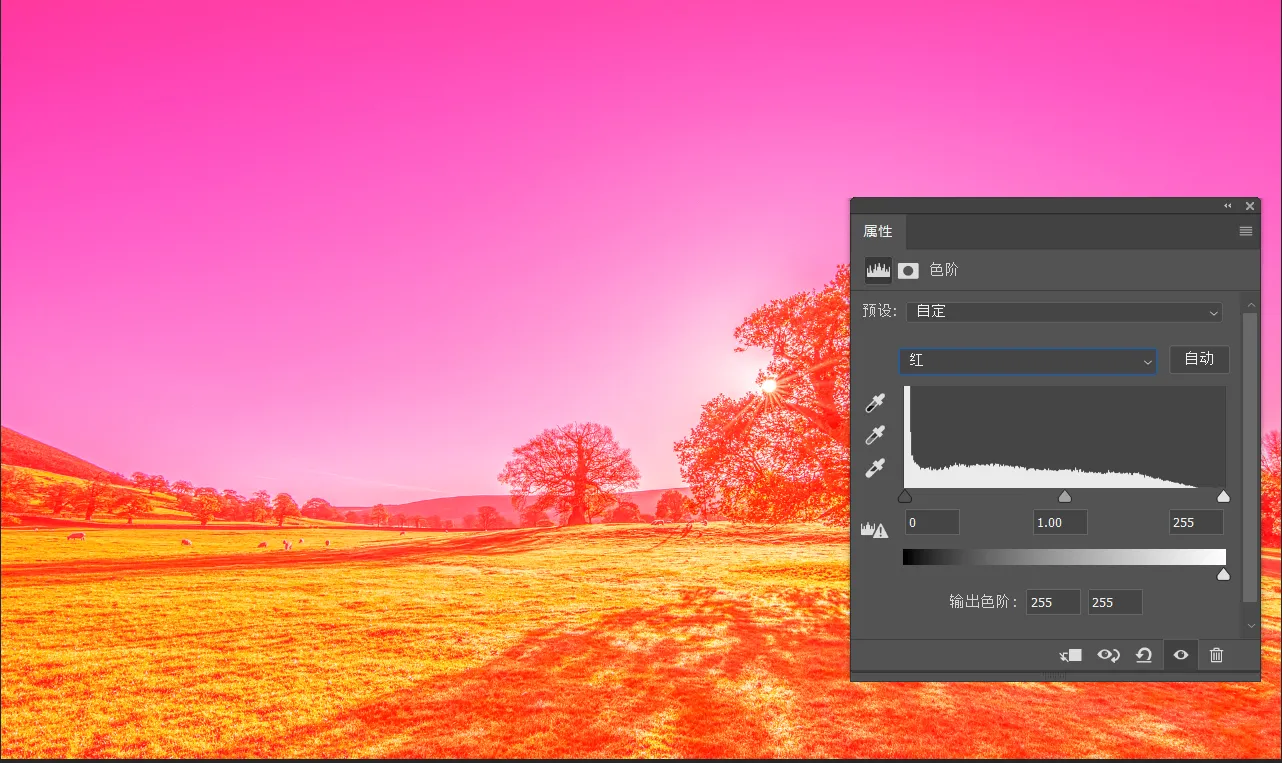
Step 1: We open the red channel and directly adjust the output color level to 255,255
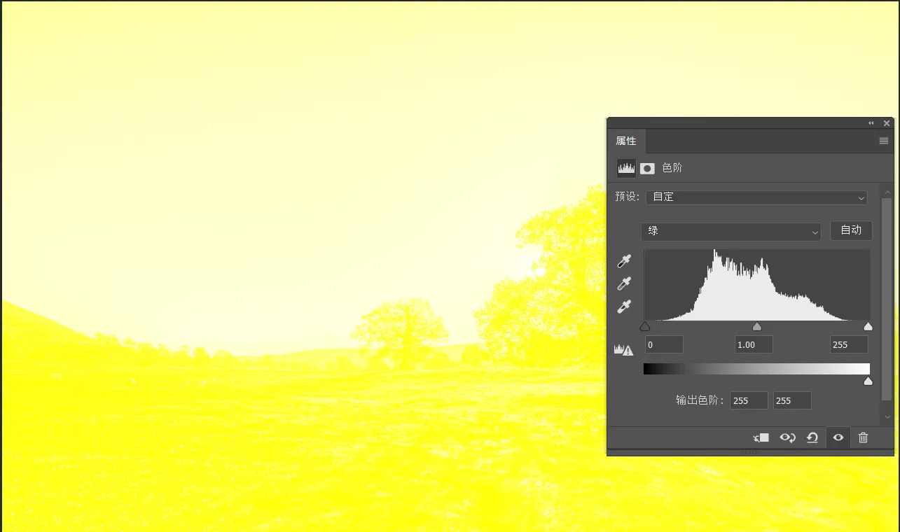
Step 2: Open the green channel, adjust the output color gradient to 255,255, at this time the screen has become a yellow color scheme
In the end we just need to erase the unnecessary areas on the mask, here I simply erased them, don't follow my example!
The above is today's tutorial, I hope you can have a better understanding of color mixing, rather than just lose the value there, of course, this technique is not just the color gradient can be used, what channel mixer ah, curves ah can be used.


Comments (0)